


We deliver a collection of timely, relevant, and curious topics across a broad landscape of interests. Join us, give us your feedback and sign up for our free weekly newsletter designed to nurture, expand, and engage the diverse world of data science.
Email us to receive our slides from Predictive Analytics World. The slides outline a framework to build an analytic mindset, including real-world examples from companies like Lyft and Citrix. Please reach out to us with feedback or to meet with us for a free consultation about how we can help train your teams in data science.
We've also published an ebook for getting started in RStudio, Git, and Github. Check it out here.
Tech >
Communication is the greatest barrier toward successful user engagement
We assumed this burgeoning alt data world was going to be a gold mine of potential alpha opportunity,” he says. “If we were able to create golden alpha opportunities from that mine, then that was going to convert into user engagement, which is what we wanted to do—we needed to be able to drive traditional investors to use quant and data science as part of their investment process. We found both of those assumptions to not be true. - Bryan Cross, UBS
UBS is betting on the power of data science to surface opportunities and build automation around investment decisions in a vertical where domain knowledge is king. Bryan Cross is leading the Quantitative Evidence and Data Science team (QED) at UBS where he acknowledges the struggle to achieve user engagement where building a new function from scratch can face challenges. Cross achieved early wins by recognizing mechanisms from other domains including an infection model that he used to assess the growth potential of companies like Zillow. By adopting a disease model where a total at risk population can be thought of as a total addressable market, Cross’ team could use an infection/adoption rate to measure growth and combine that growth with a recovery rate similar to user churn. Despite these novel insights, capturing user engagement from internal stakeholders has been a challenge in a space where this type of work is less established. Communicating value early on is critical to gaining trust with new stakeholders and socializing a team’s value. Early on Cross invested time and resources in projects with low visibility and low yield. He is now focused on identifying who his customers are and how he can use those early adopters to acquire their peers. He compares this phenomena of introducing data science to new verticals similar to the Bass model. Frank Bass was a marketing researcher that developed an s-curve to represent the adoption of technologies. The first parameter is innovation, or the coolness factor. How novel and interesting is what you’ve created? The second is the parameter of imitation, or who else is using it. Data science has created a great deal more of novelty, coolness and complexity but the community has not performed as well at identifying who its users are and how to integrate their less aware peers.
source: A Look Inside UBS's Quantitative Evidence & Data Science Team
The case for visualizing palliative care
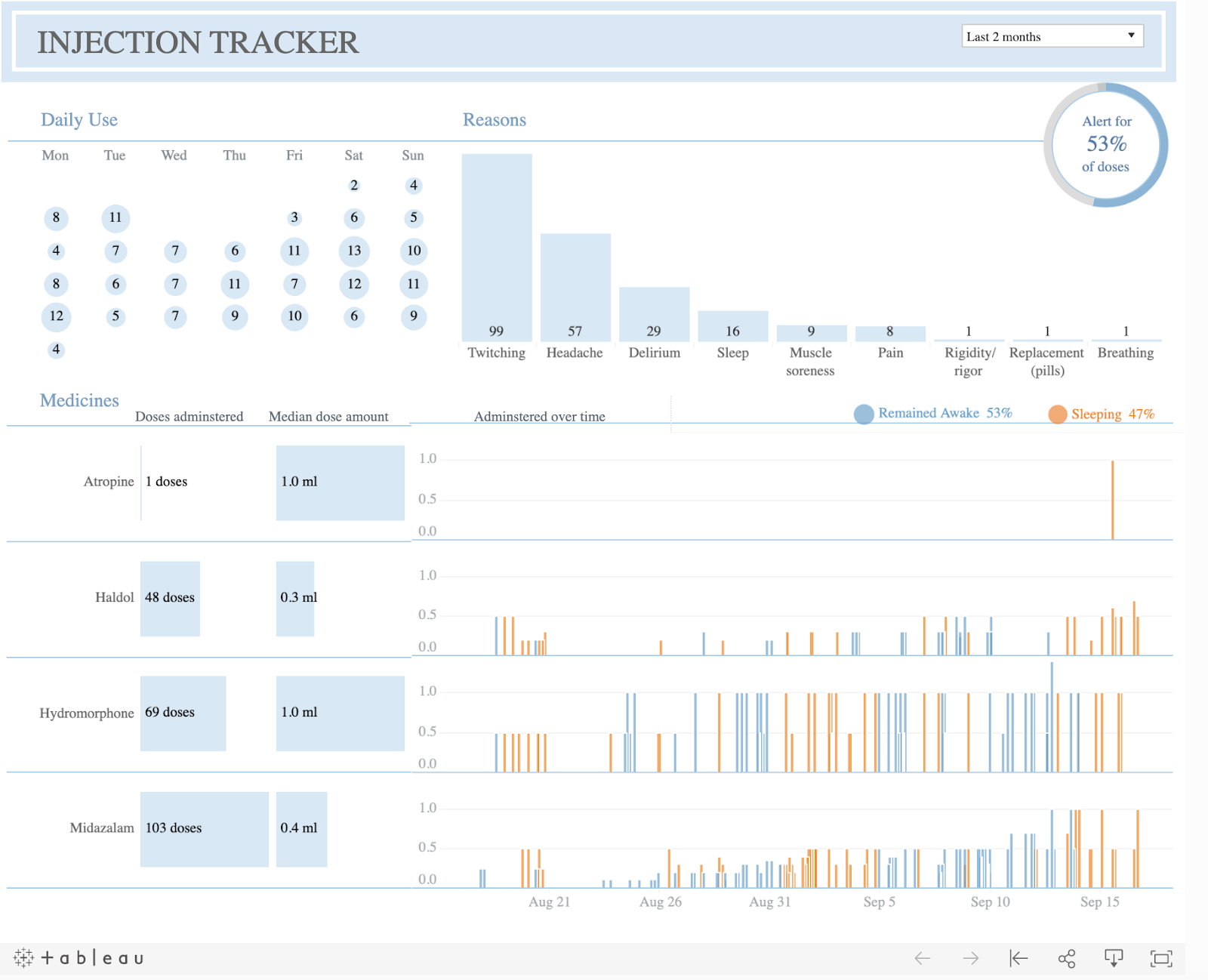
Kelly Martin was an analyst, demographer and master of data visualization who created a tableau dashboard to inform her caregivers and communicate with providers so that she could live her last days at home as comfortably as possible. Kelly lost her battle with cancer; she died September 30, 2019. What she left behind is an elegant narrative and an interpretable visualization to better understand her experience. Symptoms, medications, doses, states of consciousness and time are all components to this interactive display of end of life data. She shares with her American friends on her VizCandy blog what care focused healthcare looks like from a patient perspective and the ability for patients to focus on managing their treatment rather than how they will get treatment. Kelly and other patients need to be able to focus on care and comfort when it is already so hard to live. This data tells that story. Thank you to Bridget Cogley for writing this tremendous post and sharing an experience that will inevitably touch us all.
source: So long and thanks for all the dashboards
Health & Medicine >
Perspectives on machine learning from cutting edge healthcare
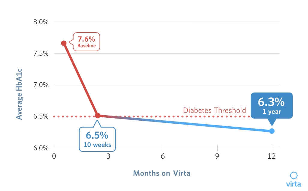
Michael Scahill is a Clinical Instructor at Stanford University and former VP of Medicine and Research at Virta Health, the cutting edge healthcare company whose protocol reverses type II diabetes. His case is that medicine is a lagging adopter to the opportunities being realized through machine learning (ML) in other domains. The example he showcases is the ASCVD risk calculator, an individual patient level measure of cardiovascular disease risk available from the American College of Cardiology in the form of a spreadsheet. Using a calculator this could take 15 minutes per patient compared with milliseconds once automated into a software tool. Deep learning has recently demonstrated as good or better performance than current methods when reconstructing images of low-dose CT scans for clinical evaluation in a study published by Nature Machine Intelligence. Low-dose CT scans reduces the risk of radiation to patients while maintaining the clinical needs of a physician to interpret the images. The integration with human physicians remains an important part of the story. Algorithms require the domain and clinical expertise of a physician to create a patient recommendation. Judgement is something we need humans for, but making that judgement more possible while improving patient experiences seems to be the algorithmic value.
source: A Physician’s Perspective: How Machine Learning Will Improve Medical Care
Science >
$350B Medicare Advantage market is differentiating with technology
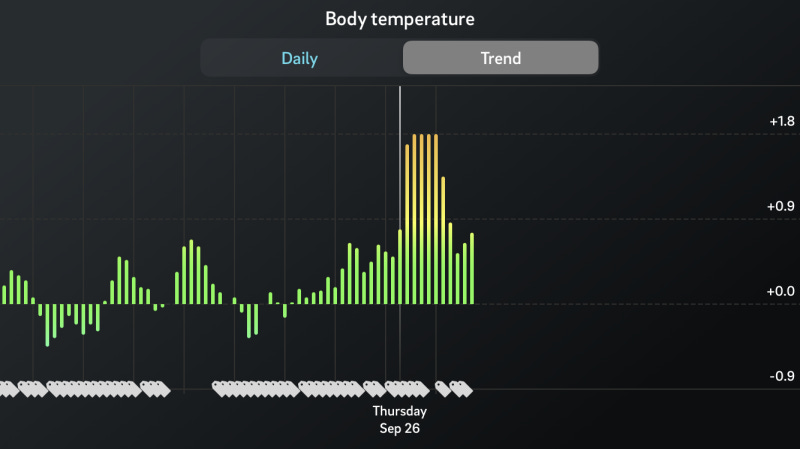
Todd and Ed Park, founders of Devoted Health are leveraging technology as a benefit for the over 20M seniors over 65 that are on Medicare Advantage plans. Their $1.8B startup is hoping to get more smart devices into a growing population of adopters with features targeted to seniors like heart health monitoring and fall detection. As a result Medicare Advantage patients will get a subsidized Apple watch as part of their healthcare benefit. Apple plans to integrate with all types of insurers, including life insurance company John Hancock. The goal is to build data collection and other feedback mechanisms to the insurer while offering actionable information and risk monitoring to the patient outside the doctor’s office. A recent LinkedIn post by Chuck Hazzard, VP of Sales at OURA, shows how after a recent tick bite his device captured an accelerated body temperature which coincided with headaches and prompted him of an infection following a tick bite. These types of engagement mechanisms can give users a set of peripheral metrics when they suspect a health event. How will companies have access to this device data? Can they use it to increase premiums and with whom can they share it with?
source: Private Medicare plan Devoted Health says it is the first to cover Apple Watch as a benefit
Money >
The richest Americans really are different, they pay less in tax
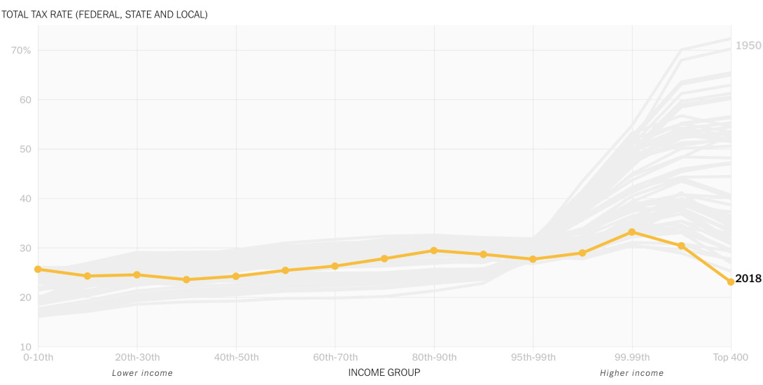
The data come from a historical database collected by researchers at the University of California who collected payments from all variety of households across the income scale. Estate and corporate taxes have sharply deceased and the commonness of tax avoidance have driven the decline in the tax rates for the wealthiest Americans. Checkout the animated visualization and corresponding New York Times article.
source: Animated line chart to show the rich paying less taxes
Media & Politics >
Visualizing political ideas
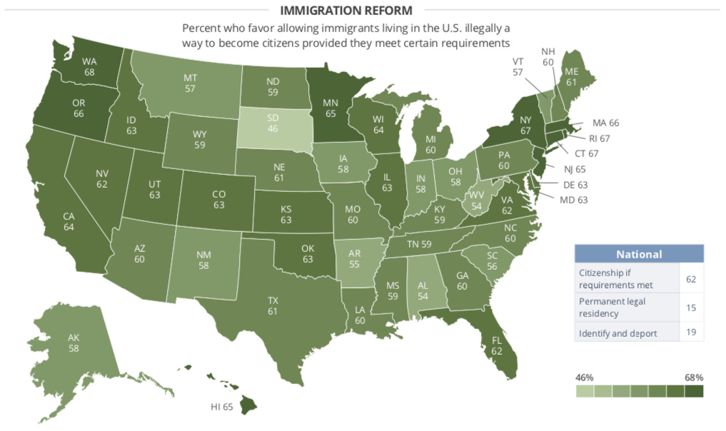
We are often challenged by the many voices and many interests that fill the political conversations happening around us. Agents of one group or another often summarize the position of many into a statement but it can be difficult to put that into context while including other factors. This is where visualizing data shines. It allows us to consume more information with more dimensions more easily and make inferences from before unseen relationships. Ian Toman at Storybench sets out 6 different examples of how we can visualize data. Mapping data is a helpful way to understand how geography may impact an idea and helps to locate one’s own ideas on a spectrum. Aleszu Bajak's mapping tutorial is a great starting point for beginners using real data from the Michigan Secretary of State website. Looking at the map above we can see that despite President Trump’s attempts to limit a path of immigration, there is nearly a two-thirds majority in the western states of California, Oregon and Washington that favor a path for immigrants living in the U.S. illegally. Visualizing data should illuminate and it should be a way to test hypotheses being declared by political agents.
source: Six ways you might consider visualizing political issues and ideologies this election
R-roundup >
How to make interactive maps with public data in R
K-nearest neighbors is one of the most commonly used algorithms in data science for grouping by similarity. Follow along in this tutorial to get started!
Source: Chapter 8 K-Nearest Neighbors
Census data for analyzing opioid prescriptions
Julia Silge is one of the greats. Here she walks us through an analysis with Tidy data using mapping and other visualizations to learn about the changing prescription behaviors of opioids in Texas.
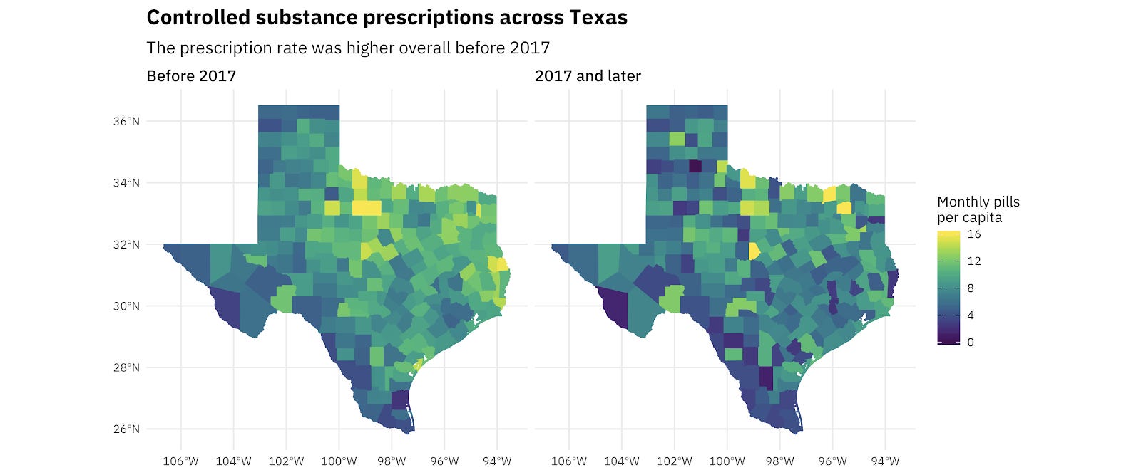
OPIOID PRESCRIBING HABITS IN TEXAS
Time series in R
Rami Krispin is a data scientist at Apple and recently gave a workshop on time series modeling in R. This is a nice resource for anyone interested and contains all the code in his GitHub repo.
Source: Time-Series-Workshop
Shiny continues to grow as a platform for building interactive and beautiful visualizations in R. RStudio produces lots of great content like this to help users get started.
Source: Shiny Maps
Follow us